Sable Journeys
A cinematic tailor-made travel company template with a day-by-day route narrative, local guide, and regional field notes
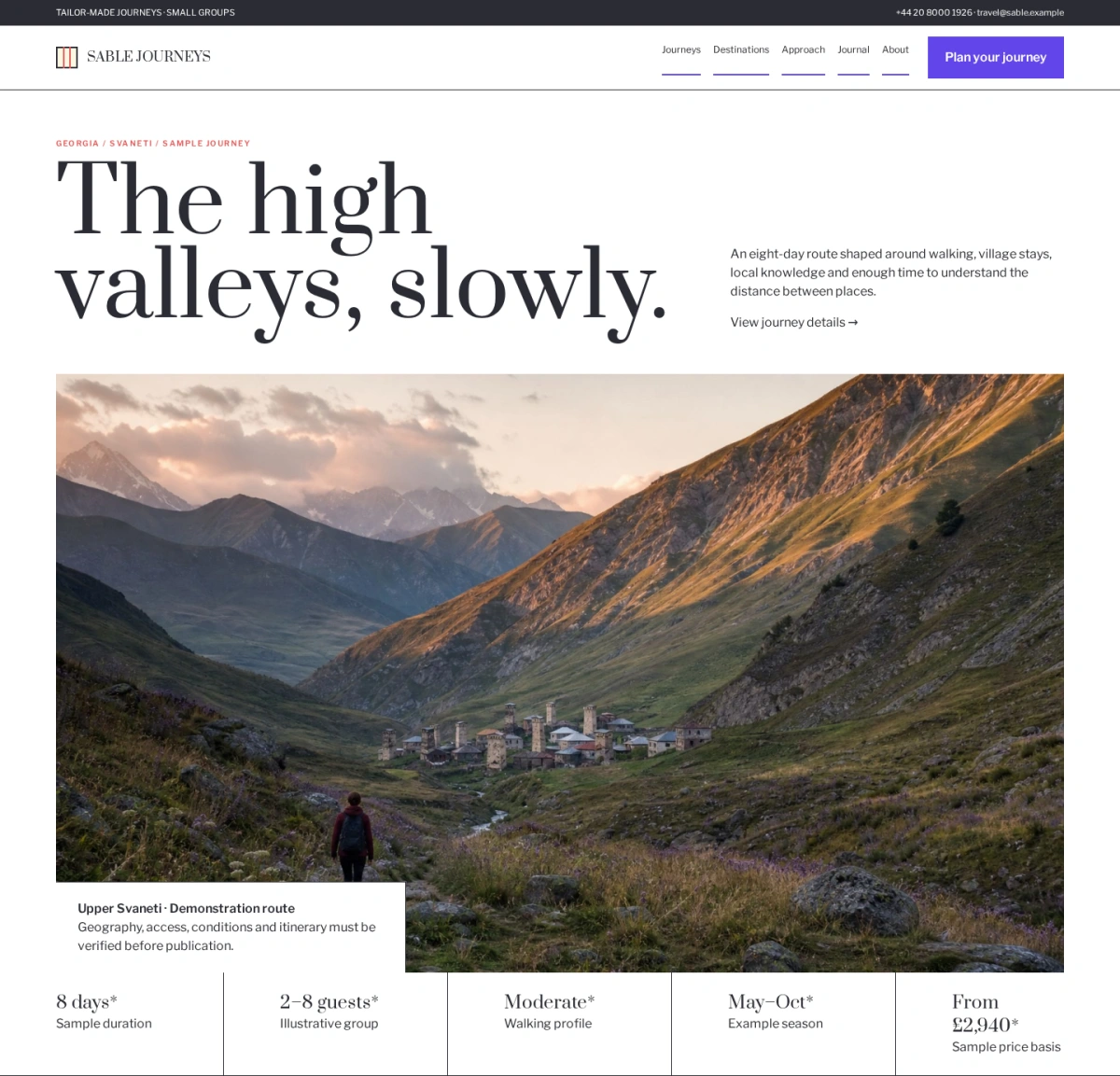
A cinematic tailor-made travel company template with a day-by-day route narrative, local guide, and regional field notes
Sable Journeys uses cinematic imagery within a bounded editorial system rather than turning the page into a travel marketplace. A destination-led opener and five-part fact band move into a day-by-day itinerary, schematic route map, consent-aware local guide narrative, place essay, unequal field-note grid, and practical planning obligations. The narrow double-line square logo echoes mountain passes in frames and route markers. Happy Hues Palette 6 supplies white reading space, charcoal authority, violet route actions, pale-lavender field-note surfaces, and restrained red editorial signals. Prata and Libre Franklin balance cultural depth with practical legibility.
Choose this template for a tailor-made travel company, small-group tour operator, destination management company, cultural journey specialist, or responsible tourism business.
Replace the SABLE wordmark with a compact transparent logo and prepare simplified light, dark, and small-screen variants. Preserve the established spacing, typography, and color hierarchy so new content feels intentional rather than appended. Keep navigation labels concrete and organize them around the decisions visitors need to make.
Rewrite the opening proposition for a specific audience, problem, and outcome. Avoid broad superiority claims, invented awards, unsupported statistics, and promises the organization cannot consistently deliver. Journey pages should state destination, duration, route, group format, accommodation, transport, physical demands, inclusions, exclusions, price basis, availability, and change conditions. Maps and travel times must reflect real geography while explaining that weather, safety, permits, and suppliers may alter plans. Destination advice should use authoritative dated sources and distinguish general guidance from personalized medical, visa, insurance, or security advice.
Obtain consent before depicting residents, guides, communities, or sensitive places. Financial protection, association membership, local partnership, and round-the-clock support claims must be verifiable for the relevant entity. Treat every photograph, illustration, diagram, icon, and interface example as replaceable content.
Use authentic assets with documented commercial rights and accurate alternative text. Keep important headings, prices, dates, status labels, controls, and actions outside photographs. When people are identifiable, obtain appropriate permission and represent the real audience without tokenism. Do not use generated imagery to imply facilities, staff, products, certifications, customers, or operating capacity that do not exist. Build repeated modules from structured fields rather than copying decorative blocks. Each destination page should have a clear owner, purpose, update schedule, and next action.
Display dates, prices, availability, locations, qualifications, measurements, and service conditions only when they are current and supportable. Explain methodology behind ratings, performance figures, comparisons, environmental claims, and outcome statistics. Archive or label superseded information rather than silently leaving it online.
Forms should request only information needed for the stated next step, identify who receives the submission, explain response timing, and show privacy context before submission. Sensitive files or personal information should move through an authenticated secure workflow rather than ordinary email or a public form.
For SEO, create substantial landing pages for meaningful services, subjects, locations, products, or resources. Give each page a unique title, description, canonical URL, logical heading structure, descriptive image alternative text, and useful internal links. Use structured data only when the visible page contains the same accurate information. Avoid mass-producing thin pages for every filter combination.
If the site is multilingual, localize terminology, dates, currencies, units, support expectations, and legal information instead of translating navigation alone. Optimize images into responsive WebP or AVIF variants with intrinsic dimensions and sensible crops.
On mobile, reflow tables, timelines, filters, comparison rows, maps, forms, and image groups without horizontal overflow. Maintain comfortable touch targets, visible keyboard focus, sufficient contrast, meaningful control labels, and reduced-motion support. Do not hide essential information behind hover. Optional analytics, advertising, chat, video, and third-party embeds must remain disabled until consent where required, with an accessible way to change preferences later.
Before launch, replace every fictional name, date, metric, image, testimonial, price, and status; verify claims, permissions, links, metadata, and legal disclosures; test navigation, search, filters, forms, notifications, error states, keyboard access, screen-reader labels, responsive layouts, performance, and consent; and add relevant privacy, terms, accessibility, contact, and operational policy pages. Establish a correction workflow so staff can update or withdraw material information quickly.
With accurate content and disciplined maintenance, the template can turn its visual system into a credible working a tailor-made travel company, small-group tour operator, destination management company, cultural journey specialist, or responsible tourism business rather than a static design demonstration.